
Colour Matrix
Following on from the self-critique of the designs I had made so far, I also thought it would be worthwhile looking at the colours that have featured in my range so far, and create a sort of matrix of combinations of these colours. Having just read Josef Albers Interaction of Colour I was interested to see how the colours related to each other.
I made a spreadsheet of the most recurring colours, and realised that I had 81 possible options!

Burns, R. 2018. Colour Matrix 1. Photograph.
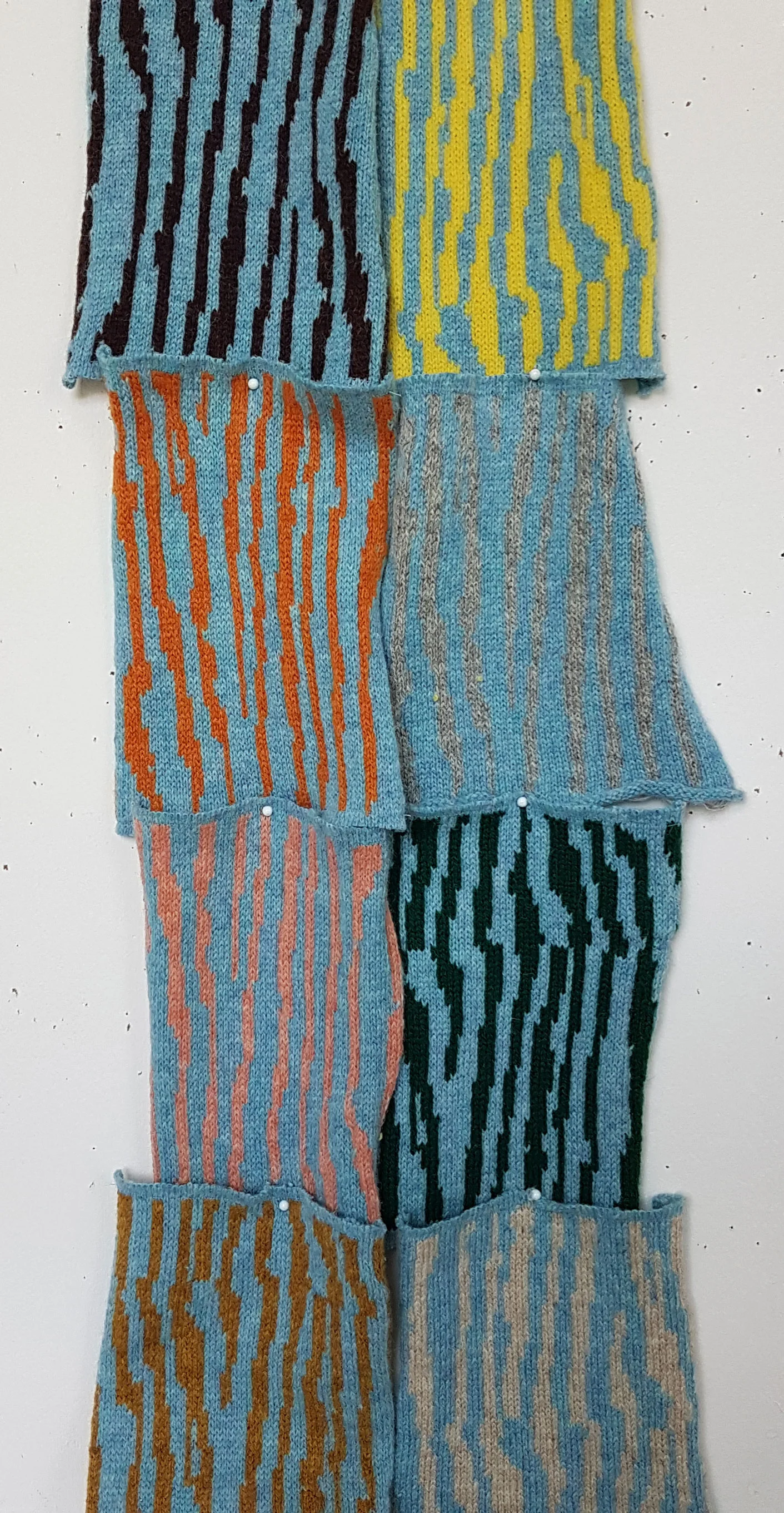
Rather than knitting all of these, I opted to knit the most 'popular' options as the background (blue, yellow, grey and beige), with the 8 other colours as the contrast colour. I used my AYAB stripe pattern, and tonally similar commercially dyed Shetland yarn that was already in my studio to avoid wasting my naturally dyed yarn, and knitted them in strips for speed, which I then cut, making sure to sew the cut ends so the knitting didn't unravel.

Burns, R. 2018. Colour Matrix 2. Photograph.
I then examined each background colour by pinning the 8 swatches onto the wall horizontally, then vertically to evaluate them. I then chose my 'favourites', or the ones that complemented each other, or contrasted in enough of a way to be visually interesting.


The grey background seemed to give the best results, I chose 6 out of the 8 swatches. The grey colour in my work has been achieved through the natural colour of certain sheep breeds, which gives a good variation in colour to the background.
My shortlist was then pinned to the wall, and I then asked people which were their favourites. Of course this was quite an unscientific method, but it helped to get some outside opinion. The blue, either in the background or foreground, proved to be the most popular, with grey as a background also liked. As I wish to champion the natural hues of British wool alongside my naturally dyed colours, it was good to be reassured that neutral shades were liked.
This exercise has given me a good reference library of colour and is something I will add to over the years. It has made me realise that my broken stripe pattern could become something of a signature design, which could appear in each collection in another colourway.

Burns, R. 2018. Colour Matrix 1-15. Photographs.
References:
Albers, J. 2013. Interaction of Color, 50th Anniversary Edition. London: Yale University Press.
Burns, R. 2018. Colour Matrix 1-15. Photographs.
If you’ve enjoyed reading this blog and found it helpful, why not buy me a virtual coffee on Ko-Fi? There’s no obligation, but your support will help me continue to write these blogs and help my journey to become a self sufficient natural dye grower and knitwear designer. Ria :)